The three-step flow
How every module works: data, parameters, export
Every MetaVidence module follows the same sequence, always in the same order: load the data, choose the parameters, review and export the results.
This page walks that whole flow, screen by screen. The images come from the binary outcomes module, but what is described here applies to all of them. Each module page covers only what changes in it.
The starting point
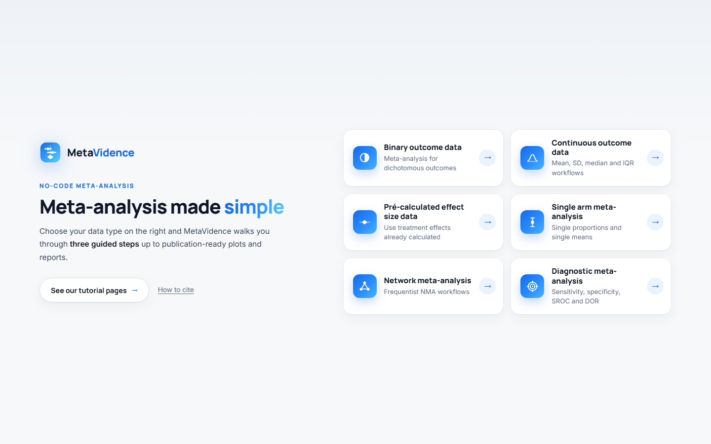
On the home page, click the card for the kind of data you have. The table on the tutorials home page says which module suits each format.
Step 1, the data
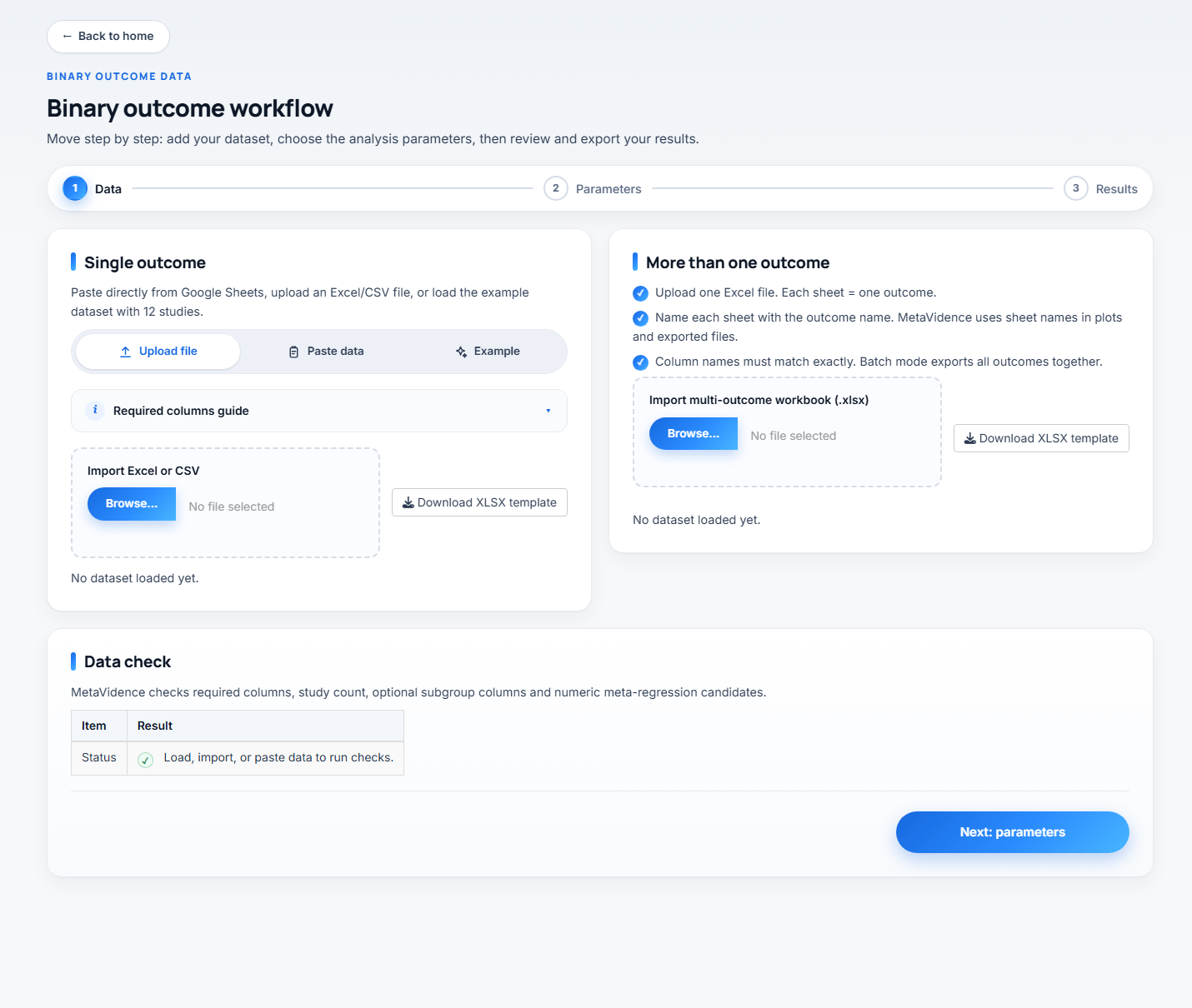
You have three routes, in the tabs of the card on the left:
- Upload file takes an Excel or CSV file. The button to download the spreadsheet template sits next to it, already with the right column names.
- Paste data pastes straight from Google Sheets or Excel.
- Example loads 12 fictional studies, so you can explore the app without preparing anything.
The required columns
The collapsible guide just below the tabs lists what the spreadsheet needs, with the exact column names for that module. Each module page carries the same list.
Any extra column is optional. Text columns become available for subgroup analysis, numeric ones for meta-regression. The example datasets carry Region, Design, RiskOfBias, MeanAge and FollowUpMonths.
The data check
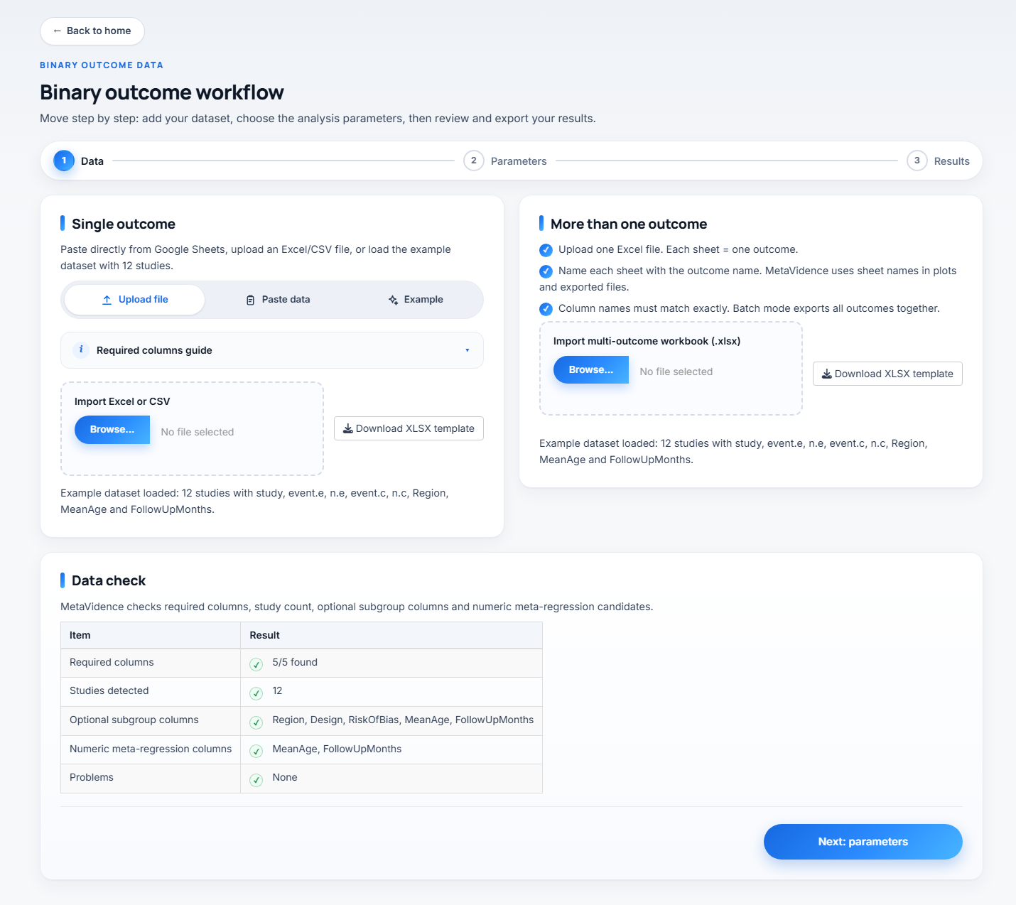
As soon as the data comes in, the Data check card reports back: whether all required columns are there, how many studies were detected, which columns are left for subgroup and meta-regression, and whether there are problems, such as blank cells, events larger than the total or sample sizes of zero.
It is worth reading before moving on. Fixing the spreadsheet now is faster than finding the error halfway through the analysis.
When everything checks out, click Next: parameters.
Step 2, the parameters
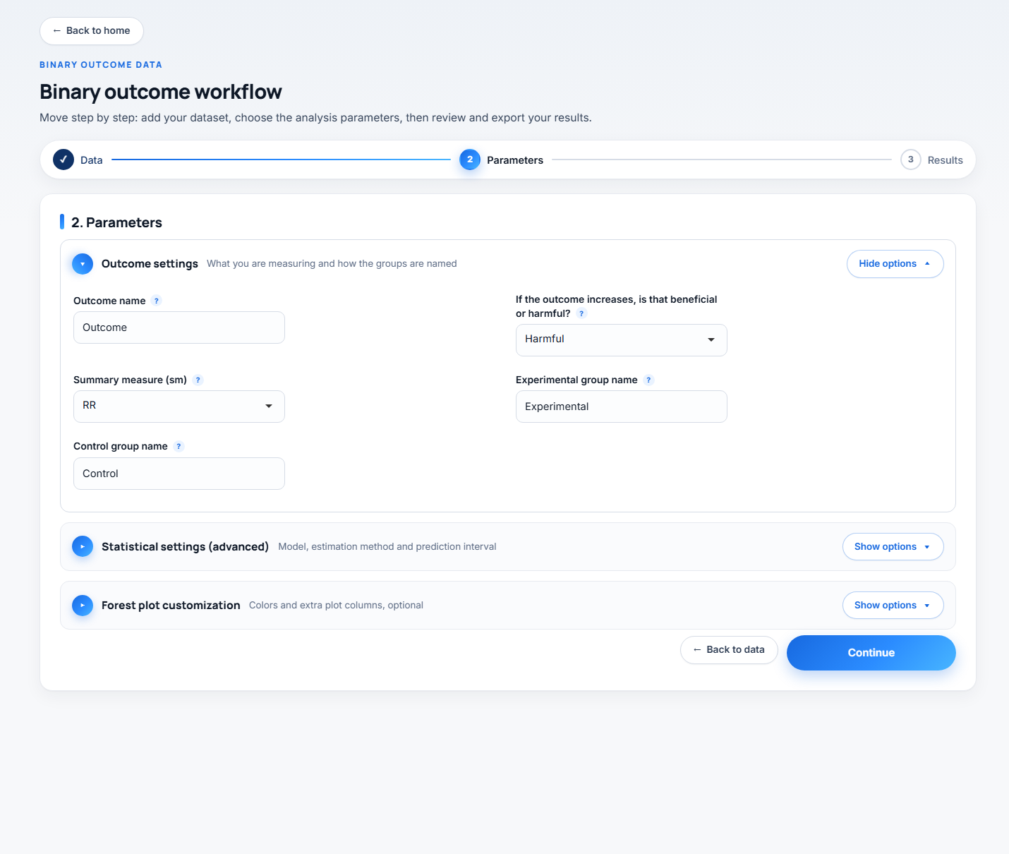
The fields come in three sections. Outcome settings opens by default, because it is the one you almost always touch. Statistical settings (advanced) and Forest plot customization start collapsed, the first because the defaults suit most cases, the second because it changes only the appearance of the plot.
Every field has a “?” next to it carrying a summary of the explanation inside the app.
Outcome settings
Outcome name (default Outcome) goes into plot titles and exported file names. It is worth replacing with something short and specific, such as 30-day mortality, because that is how the file will reach your computer.
If the outcome increases, is that beneficial or harmful? (default Harmful) only sets the “Favors experimental” and “Favors control” labels under the forest plot. It changes no numbers. Choose Harmful for bad outcomes, such as death, and Beneficial for good ones, such as cure.
Experimental group name and Control group name set how the groups appear in the plots. Replacing them with real names, such as Anticoagulant and Placebo, leaves the figure ready for publication.
Summary measure (sm) decides what gets pooled, and the options change from module to module. It is the most important choice on this screen, so it is explained on each module page.
Single-arm has no direction and no group names, because there is no comparison. Network has two fields of its own here, and diagnostic accuracy has almost nothing. See the module page.
Statistical settings (advanced)
These fields are the same in most modules, with the same defaults.
Analysis model (default Random-effects).
Random-effectslets the true effect vary between studies.Fixed-effectassumes every study estimates exactly the same effect.Bothdraws the two lines on the same forest plot.
Tau method (default REML) is the estimator of the between-study variance, τ², which drives the random-effects weights, I² and the prediction interval. REML is restricted maximum likelihood, ML maximum likelihood, DL the DerSimonian-Laird estimator, and PM, SJ, HE, HS and EB the remaining estimators implemented in meta.
I-squared method (default Q) decides how I² is computed. Q uses the Higgins and Thompson definition, I² = (Q − df)/Q. From tau-squared derives it from the estimated τ² instead. The two answer different questions and can differ substantially on the same data: on the same four studies we get 89.9% with Q and 97.2% with τ².
Prediction interval adds the range where the effect of a future study is expected to fall. It needs at least 3 studies, and with 3 or 4 the interval comes out very wide. The default varies by module.
Random CI method (default classic) sets how the confidence interval of the pooled effect is computed under the random-effects model.
classicuses the normal approximation.HK, Hartung-Knapp, uses the t distribution, which usually widens the interval.KR, Kenward-Roger, follows the same idea with a variance adjustment.
Prediction method (default V) sets how the prediction interval is computed. V uses the t distribution with k-1 degrees of freedom and HTS uses t with k-2.
Method, the pooling method, exists only in the binary and single-proportion modules, with different options in each. See the module page.
Forest plot customization
This section only changes how the forest plot looks. None of these fields touch the pooled estimate, the confidence interval or the heterogeneity statistics.
Forest square color (default Red) is the fill of the square that marks each study estimate. The options are Dark blue, Blue, Steel blue, Dodger blue, Navy, Black, Gray, Red and Dark green.
Forest square line color (default Black) is the outline of those same squares. The options are Black, Dark blue, Gray, White and Navy.
Sort studies by effect size (default No). With No, the studies appear in the order of the rows in your file. With Yes, they are ordered by the estimated effect, smallest at the top. On a subgroup forest plot the ordering happens inside each subgroup, so the groups stay together.
Additional forest plot columns (optional) prints columns of your own file next to the studies. The list is empty until a dataset is read, and then offers the columns of that file the analysis itself does not use. You can pick more than one, and the “x” on each tag removes it. The values are printed as they are in the file.
The two color fields also exist in the diagnostic accuracy module. Sorting and the extra columns do not. Network has a single field here, Network node color (default Dark blue), which applies to the network graph rather than to a forest plot. See the module page.
Subgroup and meta-regression
These two columns are not chosen here. In single-outcome analysis and in batch mode alike, you pick them in step 3, inside the result card itself, and the analysis is re-run for the column you choose.
When you are ready, click Run analysis.
Step 3, export and results
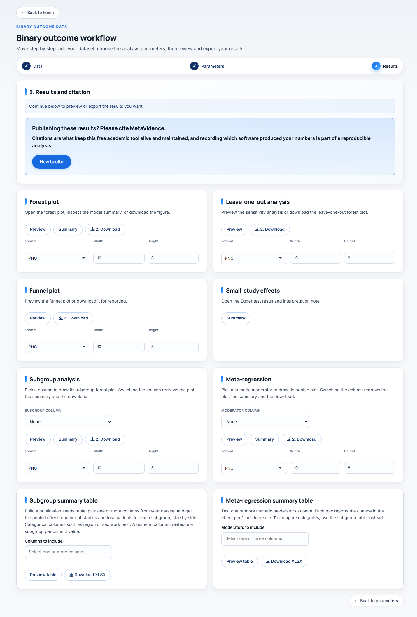
The 3. Results and citation card at the top carries the analysis status and the citation reminder. Below it comes the results grid.
Each result has its own card. Most carry Preview to see it on screen, Summary for the numeric output and Download to save. A few cards have no preview, and there the button reads Download plot so it cannot be mistaken for the summary. Format, width and height sit in each card: PNG exports at 600 DPI and PDF exports as vector, both suitable for submission.
Increase the height on the card itself and download again. That fixes almost every clipping case, because the plot area is shared between the study rows and the footer with the statistics.
Do not reload or close the tab while you still have a result you have not downloaded. The app keeps everything in the memory of the session: reloading starts a new one, and the loaded data and the results are gone. There is no way to get them back without running the analysis again.
Not every module carries all the cards below. Network and diagnostic accuracy have sets of their own, described on their pages.
Forest plot
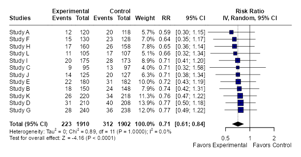
The main plot. Each study with its effect and confidence interval, the weight it received, and the diamond of the pooled effect at the bottom. Below it come the heterogeneity statistics (τ², Q, I²) and the test of the overall effect.
Leave-one-out analysis
Redoes the pooling dropping one study at a time, and plots the result of each round. It answers whether a single study is holding up the conclusion. If the estimate barely moves, the result is robust. If one study flips the direction or the significance, that belongs in the paper.
Funnel plot
The funnel plot, effect against precision. Asymmetry suggests publication bias, but it can also come from real heterogeneity or from small studies of differing quality. Interpret with caution below 10 studies.
Small-study effects
This card has only the Summary button, and it opens the Egger test result with an interpretation note. It is the formal test for the asymmetry you saw in the funnel.
Subgroup analysis
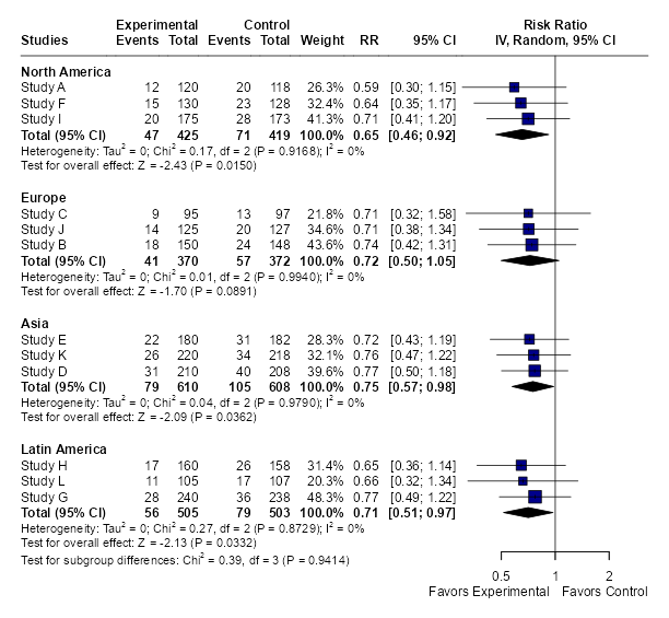
Pick a column in the selector inside the card and the plot is redrawn immediately. There is no need to go back to step 2 or rerun the analysis.
The overall pooled effect does not change when you ask for subgroups. The same analysis is rerun with the same parameters, only partitioned. What you gain is the effect within each level and the test for subgroup differences at the bottom.
Meta-regression
Pick a numeric moderator and the app draws the bubble plot, with each bubble sized by the study weight, and the fitted line. Summary gives the coefficient, the interval, the p value and the model R².
The selector lists numeric columns only, such as MeanAge or FollowUpMonths. Categorical moderators belong in the subgroup analysis, not in this card.
A common rule of thumb is at least 10 studies per moderator. Below that the coefficient is unstable and the line looks more convincing than it is.
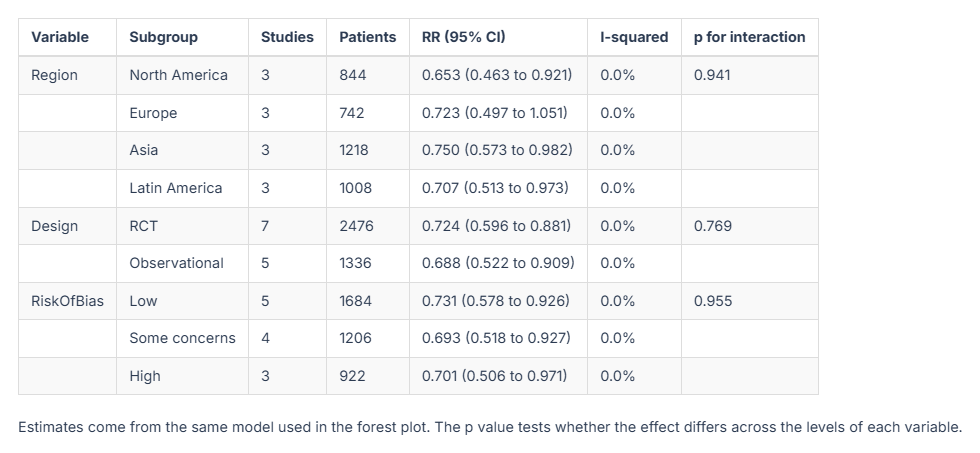
Subgroup summary table and Meta-regression summary table
Here you select several columns at once and get a single table. The subgroup one gives the effect per level, the number of studies, I² and the interaction p value for each variable. The meta-regression one gives the coefficients of each numeric moderator. These are the tables that usually go into the paper, and both export as XLSX.